Modern & Responsive TailwindCSS form in 5 minutes

July 2, 2024 5 mins TailwindCSS

Creating a modern looking form using TailwindCSS is very straight forward. This guide will take you through the steps needed to get a simple form up and running. All the sample used in this post can also be found at: tailwind-modern-form

Prerequisites

  • TailwindCSS added to your project

Barebones form markup

The below markup will be used as the base for adding our TailwindCSS classes later.

<form>
  <div>
    <div>
      <label for="f_name">First name (required):</label>
      <input type="text" name="f_name" id="f_name" required>
    </div>
    <div>
      <label for="l_name">Last name  (required):</label>
      <input type="text" name="l_name" id="l_name" required>
    </div>
  </div>
  <div>
    <div>
      <label for="p_number">Phone number  (required):</label>
      <input type="text" name="p_number" id="p_number" required>
    </div>
    <div>
      <label for="contact_type">Contact Type (required):</label>
      <select name="contact_type" id="contact_type" required>
        <option value="default" disabled selected>Select contact type</option>
        <option value="0" >Mobile</option>
        <option value="1" >Home</option>
        <option value="2" >Work</option>
      </select>
    </div>
  </div>
  <div>
    <label for="email">Email  (required):</label>
    <input type="email" name="email" id="email" required>
  </div>
  <div>
    <label for="event_date">Event date (required):</label>
    <input type="date" name="event_date" id="event_date" required>
  </div>
  <div>
    <input type="submit" value="Book appointment">
  </div>
</form>

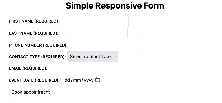
The form display should look similar to the one below, not much to look at, but we will clean it up very shortly.
Add TailwindCSS to our markup

Now that we have our markup in place, lets sprinkle a bit of Tailwind magic to get our form looking a bit better and responsive.

<form>
  <div class="grid grid-cols-1 md:grid-cols-2 md:gap-8 gap-4 mb-4">
    <div class="md:mb-4 flex flex-col col-span-2 md:col-span-1">
      <label class="pb-1" for="f_name">First name (required):</label>
      <input type="text" name="f_name" id="f_name" required>
    </div>
    <div class="md:mb-4 flex flex-col col-span-2 md:col-span-1">
      <label class="pb-1" for="l_name">Last name  (required):</label>
      <input type="text" name="l_name" id="l_name" required>
    </div>
  </div>
  <div class="grid grid-cols-1 md:grid-cols-3 md:gap-8 gap-4 mb-4">
    <div class="md:mb-4 flex flex-col col-span-3 md:col-span-2">
      <label class="pb-1" for="p_number">Phone number  (required):</label>
      <input type="text" name="p_number" id="p_number" required>
    </div>
    <div class="md:mb-4 flex flex-col col-span-3 md:col-span-1">
      <label class="pb-1" for="contact_type">Contact Type (required):</label>
      <select name="contact_type" id="contact_type" required>
        <option value="default" disabled selected>Select contact type</option>
        <option value="0" >Mobile</option>
        <option value="1" >Home</option>
        <option value="2" >Work</option>
      </select>
    </div>
  </div>
  <div class="md:mb-4 flex flex-col mb-4">
    <label class="pb-1" for="email">Email  (required):</label>
    <input type="email" name="email" id="email" required>
  </div>
  <div class="md:mb-4 flex flex-col mb-4">
    <label class="pb-1" for="event_date">Event date (required):</label>
    <input type="date" name="event_date" id="event_date" required>
  </div>
  <div class="md:mt-4">
    <input class="w-full bg-gray-100 hover:bg:gray-200 bh-schedule-appointment-submit" type="submit" value="Book appointment">
  </div>
</form>

We have one final bit to update, our style.css file. Instead of adding the same repetitive classes to the label, input and select elements we will be targeting them using the @layer directive.

@tailwind base;
@tailwind components;
@tailwind utilities;

@layer base {
  input,
  select {
    @apply border rounded p-2;
  }
  label {
    @apply text-sm font-semibold uppercase pb-1;
  }
}

Now all input, select and label elements will be default inherit the classes “applied” via the @apply function.

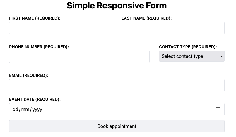
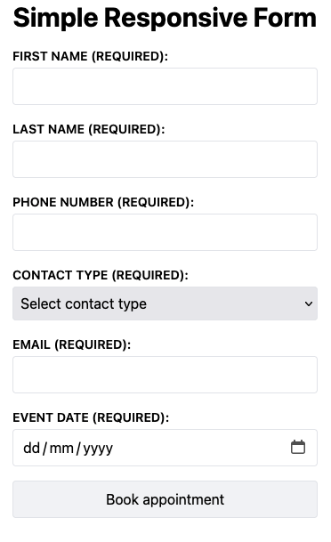
With all the above style updates completed our form should now look like the below for the respective viewports:

Desktop:
Mobile:
Conclusion

Adding styles to a form using TailwindCSS is very straight forward and allows you to quickly prototype an idea. TailwindCSS has gotten a lot of flak for being verbose when used directly on markup. The @layer directive is a huge help with cleaning up your code and can be explored when looking to package your code in a class.

How to create a custom list marker using Tailwind

March 2, 2023 3 mins TailwindCSS

This quick and easy guide will show you how to create your own custom list markers to suit your design. All the code used in this demo can be found in our repository: tailwind-custom-list-marker.

1. Prerequisites

  • TailwindCSS added to your project

2. Adding Tailwind to our markup

Below is a sample ordered list which we will be using for our demo project:

    <ol>
        <li>
            First item
        </li>
        <li>      
            Second item
        </li>
    </ol>

The list should display as shown below if there are no default styles being applied to your list:

Lets add a few Tailwind classes to our our markup:

    <ol class="ml-4">
        <li class=" my-6
            before:content-['1'] before:text-purple-400 before:text-2xl 
            before:ring-2 before:ring-offset-2 before:ring-purple-500
            before:px-3 before:py-1 before:rounded-full
            before:mr-4
        ">
            First item
        </li>
        <li class=" my-6
            before:content-['2'] before:text-purple-400 before:text-2xl 
            before:ring-2 before:ring-offset-2 before:ring-purple-500
            before:px-3 before:py-1 before:rounded-full
            before:mr-4
        ">      
            Second item
        </li>
    </ol>

With the above styles applied our list should look like the below:

3. Conclusion

Tailwind also supports the ::marker CSS psuedo-element. However, it comes with a few limitations; only a limited set of properties are supported. Any complex styling needed won’t be able to accomplished with these properties. For a full list of currently supported properties, check out the MDN Docs. The approach taken in this guide gives us the most flexibility from a styling point of view via the ::before psuedo-element.

How to quickly add Tailwind to an existing Jekyll site

February 23, 2023 4 mins TailwindCSS

The goal of this how to guide is to show you how to quickly include Tailwind CSS in your existing Jekyll site and build using the Tailwind CLI. All the code used in this demo can be found in our repository: jekyll-tailwindcss.

1. Prerequisites

  • Existing Jekyll site
  • Node.js installed

2. Install Tailwind CLI

Navigate to the root directory of your existing Jekyll site and running the below commands. These commands will install ‘tailwindcss’ as node module in your project as a dependency and initialise TailwindCSS.

npm install -D tailwindcss
npx tailwindcss init

After running the above commands you will notice a few differences with your directory, such as the inclusion of a node_modules directory and package.json files. The key file we will be focusing on however is the tailwind.config.js.

The contents of your tailwind.config.js file should be similar to the below:

/** @type {import('tailwindcss').Config} */
module.exports = {
    content: [],
    theme: {
        extend: {},
    },
    plugins: [],
}

At this point we now have TailwindCSS installed and initialised, however there is a little bit of configuring we will need to do in order to start using it in our mark up. We need to make Tailwind aware of the paths it needs to keep track of for the various classes we will be adding to our markup. For the purpose of this guide we need to keep track of files in _includes, _layouts and markdown files in our root directory.

/** @type {import('tailwindcss').Config} */
module.exports = {
    content: [ 
        '_includes/**/*.html',
        '_layouts/**/*.html',
        '*.markdown'
    ],
    theme: {
        extend: {},
    },
    plugins: [],
}

With the content array updated, Tailwind will be able to apply its styling to any .html file found in _includes, _layouts and similarly any .markdown file found on the root level of our project.

Lets now add the Tailwind directives to our main css file:

@tailwind base;
@tailwind components;
@tailwind utilities;

3. Adding Tailwind to our markup

The content I have in place for my basic site isn’t looking so great at the moment, there is no styling in place. Lets add a bit of styling to clean this up a bit.

In order to starting seeing the Tailwind classes take effect on your website you will need to run the below command.

npx tailwindcss -i ./assets/css/style.css -o ./assets/dist-style.css --watch

Note: if your CSS file is in another location you will need to update this command to reference it.

Lets start by adding a bit of styling to the header of demo site:

<header class="bg-slate-100">
    <div class="max-w-screen-lg mx-auto h-24 flex items-center">
        <a href="/">
            <h1 class="text-black text-3xl font-bold">Jekyll - TailwindCSS Demo</h1>
        </a>
    </div>
</header>

Once I refresh my browser I can immediately see the updates taking place.

We won’t cover Tailwind in detail in this post, if you are looking for more information on how to use Tailwind check out there official docs. After applying all the classes I need to clean up this page I end up with the below as my finished product:

If you would like to see all the code behind doing this you can clone the repository for this project: jekyll-tailwindcss.

All best on your journey with Tailwind & Jekyll!