Creating a modern looking form using TailwindCSS is very straight forward. This guide will take you through the steps needed to get a simple form up and running. All the sample used in this post can also be found at: tailwind-modern-form
Prerequisites
- TailwindCSS added to your project
Barebones form markup
The below markup will be used as the base for adding our TailwindCSS classes later.
<form>
<div>
<div>
<label for="f_name">First name (required):</label>
<input type="text" name="f_name" id="f_name" required>
</div>
<div>
<label for="l_name">Last name (required):</label>
<input type="text" name="l_name" id="l_name" required>
</div>
</div>
<div>
<div>
<label for="p_number">Phone number (required):</label>
<input type="text" name="p_number" id="p_number" required>
</div>
<div>
<label for="contact_type">Contact Type (required):</label>
<select name="contact_type" id="contact_type" required>
<option value="default" disabled selected>Select contact type</option>
<option value="0" >Mobile</option>
<option value="1" >Home</option>
<option value="2" >Work</option>
</select>
</div>
</div>
<div>
<label for="email">Email (required):</label>
<input type="email" name="email" id="email" required>
</div>
<div>
<label for="event_date">Event date (required):</label>
<input type="date" name="event_date" id="event_date" required>
</div>
<div>
<input type="submit" value="Book appointment">
</div>
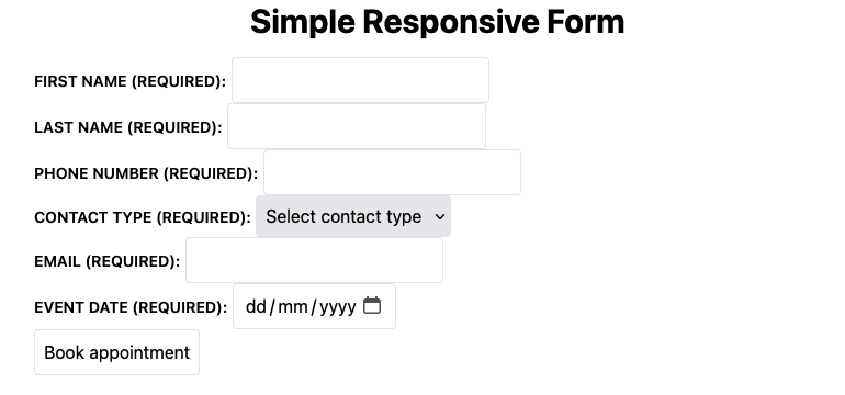
</form>The form display should look similar to the one below, not much to look at, but we will clean it up very shortly.
Add TailwindCSS to our markup
Now that we have our markup in place, lets sprinkle a bit of Tailwind magic to get our form looking a bit better and responsive.
<form>
  <div class="grid grid-cols-1 md:grid-cols-2 md:gap-8 gap-4 mb-4">
    <div class="md:mb-4 flex flex-col col-span-2 md:col-span-1">
      <label class="pb-1" for="f_name">First name (required):</label>
      <input type="text" name="f_name" id="f_name" required>
    </div>
    <div class="md:mb-4 flex flex-col col-span-2 md:col-span-1">
      <label class="pb-1" for="l_name">Last name  (required):</label>
      <input type="text" name="l_name" id="l_name" required>
    </div>
  </div>
  <div class="grid grid-cols-1 md:grid-cols-3 md:gap-8 gap-4 mb-4">
    <div class="md:mb-4 flex flex-col col-span-3 md:col-span-2">
      <label class="pb-1" for="p_number">Phone number  (required):</label>
      <input type="text" name="p_number" id="p_number" required>
    </div>
    <div class="md:mb-4 flex flex-col col-span-3 md:col-span-1">
      <label class="pb-1" for="contact_type">Contact Type (required):</label>
      <select name="contact_type" id="contact_type" required>
        <option value="default" disabled selected>Select contact type</option>
        <option value="0" >Mobile</option>
        <option value="1" >Home</option>
        <option value="2" >Work</option>
      </select>
    </div>
  </div>
  <div class="md:mb-4 flex flex-col mb-4">
    <label class="pb-1" for="email">Email  (required):</label>
    <input type="email" name="email" id="email" required>
  </div>
  <div class="md:mb-4 flex flex-col mb-4">
    <label class="pb-1" for="event_date">Event date (required):</label>
    <input type="date" name="event_date" id="event_date" required>
  </div>
  <div class="md:mt-4">
    <input class="w-full bg-gray-100 hover:bg:gray-200 bh-schedule-appointment-submit" type="submit" value="Book appointment">
  </div>
</form>
We have one final bit to update, our style.css file. Instead of adding the same repetitive classes to the label, input and select elements we will be targeting them using the @layer directive.
@tailwind base;
@tailwind components;
@tailwind utilities;

@layer base {
  input,
  select {
    @apply border rounded p-2;
  }
  label {
    @apply text-sm font-semibold uppercase pb-1;
  }
}
Now all input, select and label elements will be default inherit the classes “applied” via the @apply function.
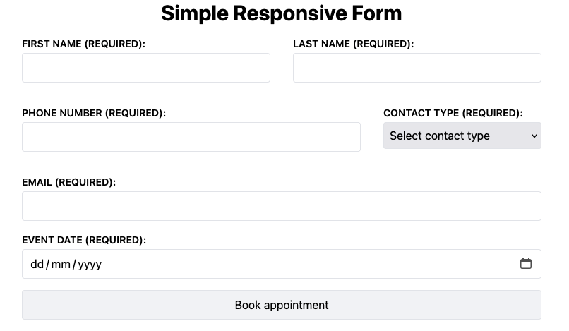
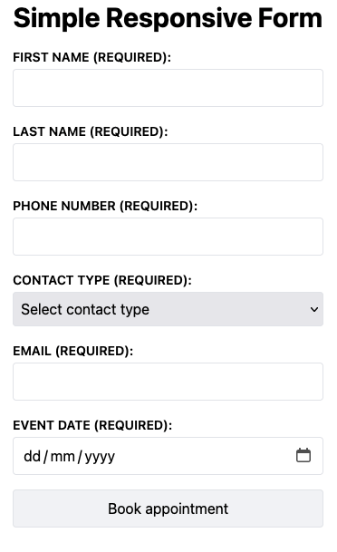
With all the above style updates completed our form should now look like the below for the respective viewports:
Desktop:
Mobile:
Conclusion
Adding styles to a form using TailwindCSS is very straight forward and allows you to quickly prototype an idea. TailwindCSS has gotten a lot of flak for being verbose when used directly on markup. The @layer directive is a huge help with cleaning up your code and can be explored when looking to package your code in a class.